Evaluating historical cash, bond, and stock financial asset class returns with and without inflation
This US historical average stock market return, bond returns, and cash investment performance article is a 2000 update of an extensive article I wrote six years ago. The original article was published on another financial website in 2014. This update was written in mid-2020, during the early months of the global Covid-19 pandemic.
You should note that all of the 90+ year stock, bond, and cash performance information presented below in 18 graphics and the associated text are for the period from the beginning of 1929 through the end of 2019. Therefore these data includes the effects of the 1929 Stock Market Crash and the subsequent Great Depression.
In effect this is a stock, bond, and cash asset class investment returns peak-to-peak analysis encompassing over 90+ years of US historical securities market returns. The year 1929 was near the peak of the Roaring Twenties US financial markets and the end of 2019 was effectively the peak of the financial markets prior to the onset of the Covid-19 pandemic in early 2020. (Note that this means the cumulative investment returns graphics in this article do not include the influence of the pandemic on financial markets.)
While it is clear that this global pestilence will be with us for many years and will/should profoundly change human behavior until effective vaccine(s) are broadly distributed, the long-term stock market return effects are not yet clear. By mid-2020, the stock markets had largely shrugged off the pandemic and in theory had priced in this global pandemic’s economic effects. However, we need time to see whether or not this assessment is optimistic.
U.S. investment returns for stock, bond, and cash financial asset classes
Very often, long-term historical U.S. asset class returns for the primary stock, bond, and cash financial investment asset classes are presented as:
- graphics with cumulative long-term average stock market return and bond market returns,
- simple historical returns averages, or
- dense tables of numbers of stock returns by year or bond index returns by year
These approaches can be less than satisfying, because the relative performance of asset classes has varied over time depending upon the financial, economic, monetary, political, and inflationary situation within major sub-periods.


In this article, I will first present 90+year asset class cumulative rate of returns graphics to illustrate this problem. Then, I will break down this longer 90-year period into six major sub-periods that illustrate how cash, bond, and stock asset class performance has varied depending upon the conditions of that period.
We begin by looking at US cumulative average cash, bond and stock market return by year graphics from the beginning of 1929 to the end of 2019 with and without inflation. Then, because the cumulative stock return over the last 90 years completely overwhelms those of the other cash and bond asset classes graphically, we will look at just U.S. bond return rates and cash returns from 1929 to 2019 with and without inflation.
Later, we will break down 1929 to 2019 into these six distinct periods:
- Stock market crash, Great Depression, and World War II (1929 through 1946)
- Post-World War II economic expansion boom (1947 through 1968)
- Escalation of inflation and increasing economic stagnation (1969 through 1981)
- Stock and bond bull markets as inflation recedes, including the Dot Com Bubble and mania (1982 through 1999)
- & 6. Dot Com crash and recovery; then Credit Crisis, Great Recession, and recovery (2000 through 2019). The 2000 through 2019 period will then be broken down into two sub-periods, because the major financial asset classes behaved quite differently during these periods:
- 5) 2000 to 2008: Dot Com crash, recovery with real estate inflation, and Credit Crisis / Great Recession crash (wherein bond market returns by year were much higher than average stock market return by year)
- 6) 2009 to 2019: Credit Crisis / Great Recession recovery (wherein bond market returns by year and average annual stock market returns accelerated)
Major economic, political, and securities market events influenced the choice of 1947, 1968, 1982, 2000, and 2009 as the breakpoints in splitting 1929 to 2019 into six periods. No attempt was made to make these six periods be of equal duration. The focus was on selecting distinct periods that could be described by the major economic, political, and securities market events that characterized them.
Cumulative cash, bond, and stock market returns for each period
For the period represented by each particular graphic, it is assumed that one dollar was invested in each of the U.S. cash, bond, and stock asset classes at the beginning of the first year. No additional funds were added thereafter. Any change in asset value over time represents the total annually compounded gross return (pre-tax without investment expenses) for that cash, bond/fixed income, or stock/equity asset class. Average annual asset class cash, average bond return, and average stock market return figures include both changes in asset market value plus reinvested interest and/or dividends.
For some of these select year breakpoints between major periods, perhaps one could argue that they should have been made a year or more earlier or later. Being overly concerned about a precise break-point year tends to miss the point. By breaking this 90+year period into six shorter periods, we can more effectively see graphically how the stock, bond, and cash asset classes performed in relative terms with periods. Should you prefer a different year as a break point, simply view the adjacent graphics, note value changes for nearby years, and then make mental adjustments to calculating rate of return for a particular graphic.
18 historical investment performance graphics with and without inflation
This article includes a total of 18 historical U.S. asset class returns graphics. Nine graphics are provided in terms of inflationary dollars and a corresponding nine in real dollars. (Note that on the screen, the background color of all inflationary graphics is lighter blue, and the background color of all real dollar graphics is darker blue.)
Concerning the U.S. annual data for stocks (S&P 500 index performance history), bond (10-year Treasury Bonds), cash (3-month Treasury Bills), and inflation (U.S. urban Consumer Price Index(CPI)), several sources were consulted including:
- US Bureau of Labor Statistics (urban consumer price index)
- Standard and Poors (S&P 500 historical returns by year from 1957 onward and S&P Index historical returns from 1929 to 1956)
- Damodaran Online (Dr. Aswath Damodaran, Professor of Finance, New York University Stern School
- Online Data (Dr. Robert J. Shiller, Professor of Economics and Finance, Yale University
Inflationary dollars versus real, constant purchasing power dollars
For each period being discussed, the first lighter-blue graphic presents asset class values using inflationary dollars. Then, the following paired darker-blue graphic provides the same cash, bond market return, and stock market returns information in real dollar terms adjusted for inflation.
When cumulative investment performance over time includes an inflationary component, it can appear that significantly more assets have accumulated. However, a portion of these cumulative historical returns are “not real,” because inflation debases the value of a dollar over time. In effect, some of the apparent cumulative asset appreciation is simply due to a change in the value of the dollar or a change in the unit of counting over time.
To adjust for the effects of inflation, it is necessary to remove the inflationary component for cumulative stock, bond, and cash asset class returns. This is done by dividing the cumulative inflationary return of an investment over a period by the cumulative inflation index over that same period. The result is what as known as “real dollars,” which represent constant purchasing power over time.
Real dollars with the inflationary component removed are much easier to interpret. Assume that at the start of a period some product or service cost $1. At the start of the period, you invested $1 in an investment asset that appreciated over time to become $3 measured in “real dollars” with inflation removed. At the end of the period you would have the purchasing power to buy three units of the product or service because your investment was measuring in real dollars with inflation removed. However, if instead the $3 was measured in inflationary dollars and $1 of the $3 was due to inflation, then your real dollar constant purchasing power would only allow you to purchase two units of the product or service.
US stock market return, 10-year US Treasury bond market return, and 3-month US Treasury bill cash returns from 1929 to 2019 using inflationary dollars
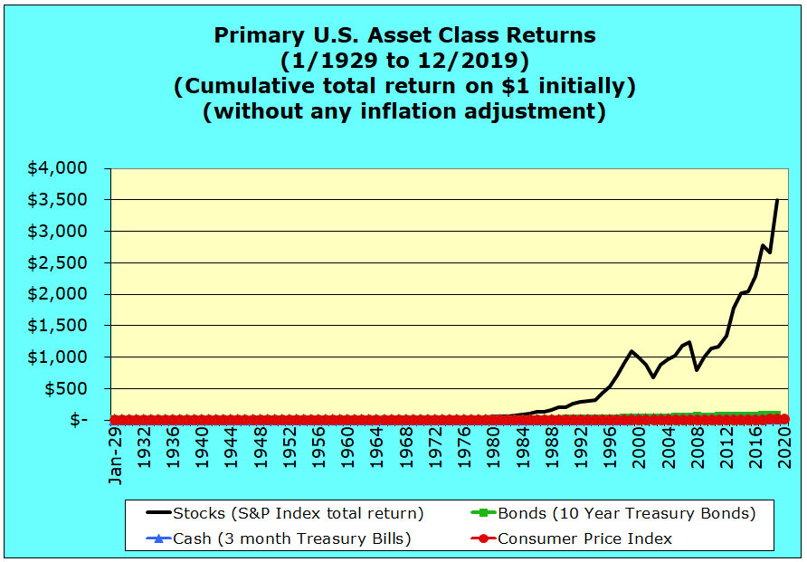
Over very long periods and especially during the second half of the 20th century, cumulative S&P 500 index returns for stocks have been so high in relative terms that they have dwarfed cash and bond return rates. Yet few investors have the luxury of holding only stock investments for decades hoping to capture higher stock returns. Even committed buy-and-hold investors with a very high tolerance for the risk of investing in stocks, sometimes need to draw cash down their investments to fund unplanned negative cash flow when they lack other income sources to cover ongoing expense outlays. They would prefer not to have to liquidate stocks to raise cash during significant and unpredictable stock market declines.
Academic research has demonstrated that even highly risk tolerant investors tend to benefit from holding at least some minority cash and bond asset positions over time. This is especially true, when there is uncertainty about when an investor might need to draw down some of their equity assets to fund negative cash flow. Unplanned cash flow draw-downs tend to be correlated with the loss of income associated economic downturns, and these downturns tend to be highly correlated with stock market sell-offs.
This 1929 to 2019 inflationary dollar graphic illustrates how long-term average stock market returns have dwarfed long-term average bond market returns and cash returns. One dollar invested in common stockholders equity at the beginning of 1929 through the end of 2019 had a cumulative gross total return factor of 3,483 times measured in inflationary dollars. (The initial $1 invested initially grew to $3,483 over this 90-year period of historical average stock market return performance by year stated in inflationary dollars.)
Cumulative stock returns have been so high in relative terms that this graphic makes it appear that cash and bonds have barely appreciated over this long period. Furthermore, relatively high asset appreciation in recent decades makes it appear that stock investment returns only began to diverge in the mid-1970s to leave cash and bonds in the dust. The next real dollar graphic for this same historical period will demonstrate that this was not actually the case.
US stock market return, 10-year US Treasury bond market return, and 3-month US Treasury bill cash returns from 1929 through 2019 using real dollars
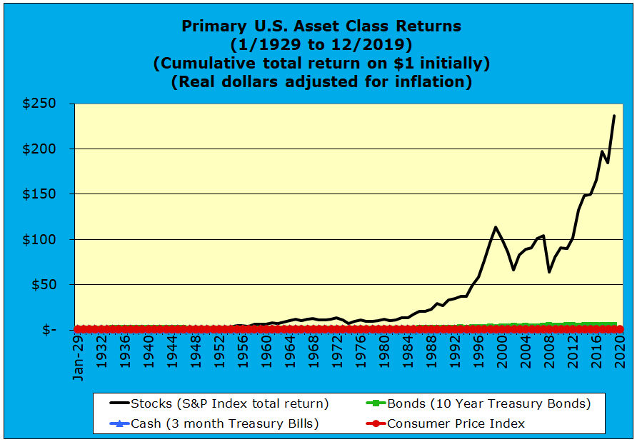
This graphic presents the same cumulative long-term cash, bond, and stock returns, but the data have been adjusted for inflation. One dollar invested in stocks at the beginning of 1929 through the end of 2019 had a cumulative gross total return factor of 237 times measured in real, constant purchasing power dollars. (The initial $1 invested initially grew to $237 over this 90-year period of historical average stock market return performance stated in real, constant purchasing power terms.)
In addition, this real dollar chart now makes it seem that stock market returns began to diverge from cash and bond returns in the mid-1950s rather than in the mid-1970s, which was suggested by the earlier inflationary dollar graphic.
From the two charts above, clearly we can learn something about cumulative long term U.S. average stock market return, but nothing about cash investment performance and returns on bonds. Since S&P 500 index historical returns have been so overwhelming in relative terms, one approach is simply to exclude historical average stock market return data, if one wishes to understand better the relative cumulative cash and fixed income returns over this 90+ year period graphically.
US 10-year treasury bond market return and 3-month US treasury bill cash returns from 1929 to 2019 using inflationary dollars (excludes historical stock returns)
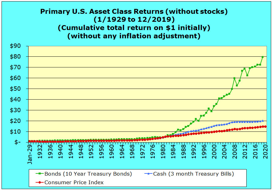
The graphic above indicates that one dollar invested in 10 year U.S. Treasury bonds at the beginning of 1929 through the end of 2019 had a cumulative gross total fixed income/bond market return factor of 97 times measured in inflationary dollars. (The initial $1 invested initially grew to $97 over this 90-year period of historical US Treasury fixed income/bond market returns stated in inflationary dollars.)
For cash returns one dollar invested in 3 month U.S. Treasury bills at the beginning of 1929 through the end of 2019 had a cumulative gross total return factor of 20 times measured in inflationary dollars. (The initial $1 invested initially grew to $20 over this 90-year period of historical US Treasury bill cash market returns stated in inflationary dollars.)
However, you should also note that over this period US urban CPI inflation eroded the value of a dollar by a factor of almost 14 times.
US 10-year treasury bond market return and 3-month US treasury bill cash returns from 1929 to 2019 using real dollars (excludes historical stock returns)
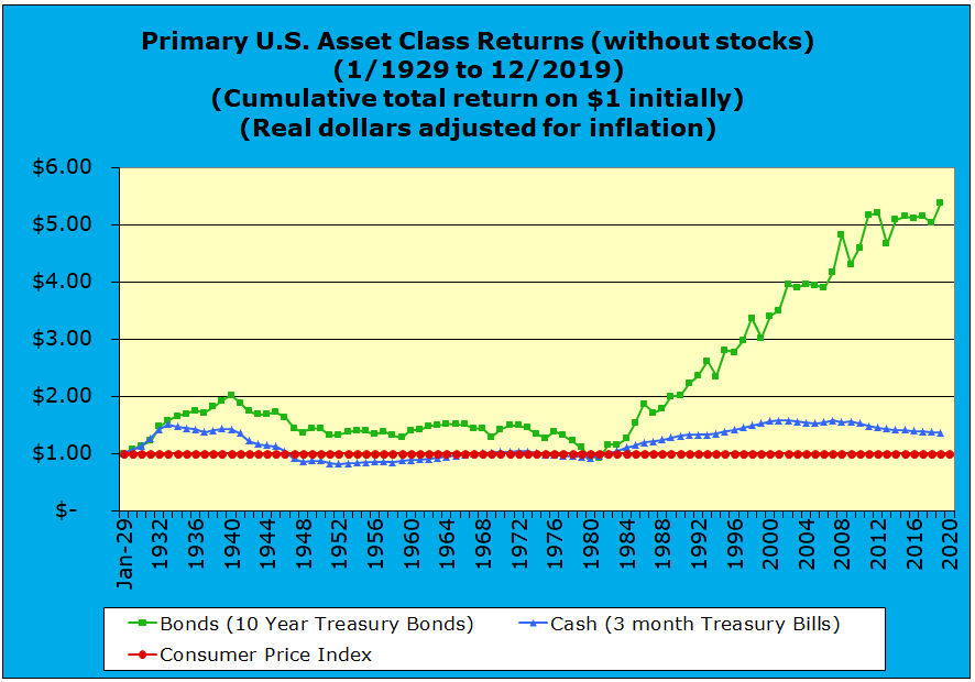
This chart presents the same cumulative gross long-term cash interest and return on bonds, but the data have now been adjusted for inflation. As noted above, inflation eroded purchasing power over this period by a factor of 14.76 times.
This graphic indicates that one dollar invested in 10-year U.S. Treasury bonds at the beginning of 1929 through the end of 2019 had a cumulative gross total return factor 5.4 times, when measured in real dollars. (The initial $1 invested initially grew to $5.40 over this 90-year period of historical US Treasury 10-year bond market returns stated in real, constant purchasing power dollar terms.)
For cash returns, one dollar invested in 3-month U.S. Treasury bills at the beginning of 1929 through the end of 2019 had a cumulative gross total return factor of 1.4 times measured in real dollars. (The initial $1 invested initially grew to $1.40 over this 90-year period of historical US Treasury 3-month cash market returns stated in real, constant purchasing power dollar terms.)
Now we will move from looking at historical returns of the S&P 500, bond market performance, and cash returns for the full 1929 through 2019 period and instead break this full 1929 through 2019 period into sub-periods.
Long-term historical cash, bond, and stock market returns broken down into six sub-periods with and without inflation
The remainder of this article will break down cumulative 1929 to 2019 returns into the six distinct periods listed above in the introduction. For each of these periods, you will find separate graphics of cumulative inflationary dollars (the lighter blue graphics) and real dollars (the darker blue graphics) for the average cash, bond, and stock market return performance of these primary financial asset classes.
Again, keep in mind that on every graph it is assumed that one dollar is invested into each of the three major cash, bond, and stock asset classes at the beginning of each of these six sub-periods. Total returns by asset class are presented, including asset market value changes plus reinvested interest and dividend payouts. Returns are gross and do not include any taxes or investment expenses.
Stock market crash, Great Depression, and World War II from 1929 through 1946 using inflationary dollars
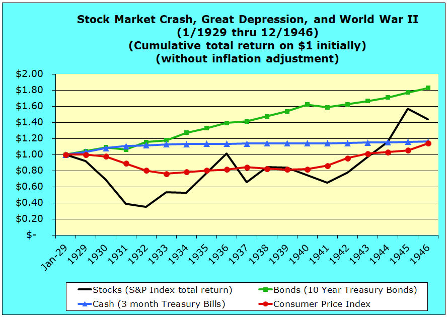
One of the first things that this chart illustrates is that stock market returns by year declined in a continuous train wreck until 1932. So much historical memory has focused on 1929 and Black Friday that some people do not realize that the years following were much worse in terms of year-over-year returns.
This graphic starts with January 1929 values, including 1929 stock market crash. By starting with 1929 we exclude from the cumulative asset class returns the significant run-up in common stockholders equity stock asset values during the earlier 1920s.
In the first half of 1929, stock prices had continued to run up significantly, so the full year effect of the 1929 crash was that 1929 year-beginning to 1929 year-end stock prices prices fell “only” by 8.3%. In contrast, year-over-year stock prices collapsed by an additional 25.1% during 1930, then 45.8% more in 1931, and by 8.6% more during 1932. Measured by calendar years, the cumulative collapse was 65% for 1929 through 1932.
This inflationary dollar graphic shows this 65% value for one dollar invested in stocks at the beginning of 1929. Using annual calendar year figures, tends to mask the somewhat greater peak to trough decline that occurred in stock prices measured on a daily basis. This is not very important, because our purpose is to understand relative behaviors between the stock, bond, and cash financial asset classes across the 1929 stock market crash, through the Great Depression, and through World War II period.
Clearly, an investor with a portfolio more heavily invested in bonds and cash did better throughout most of this period that those whose investment portfolios were more heavily invested in the S & P stock market index. It was only until after WWII, that common stockholders equity prices recovered and almost closed the valuation gap with bonds.
When the stock to bond gap was at its greatest during the Depression at the end of 1932, in inflationary dollars the initial bond dollar was worth $1.15, while the initial stock dollar was worth only $.35 for a difference of 80 cents. A second peak inflationary dollar valuation gap occurred in 1941, when the original bond dollar was worth $1.59, while the original stock dollar was worth only $.65 for a difference of 94 cents.
In addition to the more well known advantage of bonds and cash versus the average stock market return over this period, there is a lesser know story that this chart tells us. From 1929 through 1932, the U.S. economy suffered cumulative deflation of almost 25%. If you ever wonder why central banks during the more recent Credit Crisis and Great Recession expressed so much concern about deflation and took such extraordinary measures to prevent deflation, the reasons can be found in the 1929 to 1932 period.
Laissez faire national fiscal and monetary policies during 1929 to 1932 period were almost completely hands-off, and securities markets, the economy, and consumer prices were left to find their own equilibrium points. Unfortunately, those were very low equilibrium points that induced a severe and sustained depression.
Economic demand plummeted, because the one-quarter of the working population that was unemployed could afford to buy very little. Moreover, the remainder of the population who still had jobs and/or possessed financial assets did not consume as they might normally. Deflation in the Depression was so pernicious, because declining prices provided an incentive to delay consumption. Particularly during the first five years of the Depression, the cost of products and services declined steadily. Delaying consumption is hardly a recipe for a growing economy, and the 1929 to 1932 period is an important case study for anyone who wishes to understand the deleterious effects of deflation.
Stock market crash, Great Depression, and World War II from 1929 through 1946 using real dollars
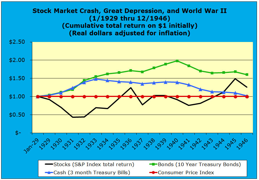
The 1929 through 1946 real dollar graphic below adjusts cash, bond, and stock values for changes in the urban Consumer Price Index over this period. This chart displays asset values in terms of constant purchasing power, and thus the CPI line is displayed as a constant $1 over this period.
Note that the real dollar charts below for each of these five major sub-periods all draw a constant CPI, wherein the CPI is, in effect, adjusted by itself. Holding CPI at a constant $1 value is intended to remind the reader that all asset values on these real dollar charts are inflation adjusted and reflect constant purchasing power over time.
During the worst of the financial collapse from 1929 through 1933, it is notable that a flight to asset safety caused the real dollar value of both cash and bonds to escalate by 50% to about $1.50 for each dollar invested at the beginning of 1929 through 1933. Also, in 1931, stock values had begun to stabilize in real dollar terms and recover unevenly in value between 1932 and 1936, reflecting the fragile financial recovery that began with the New Deal era.
In 1934, cash and bond asset values began to diverge, as the value of holding cash declined over the remainder of the period, while bond values moved upward to peak at about $2 in real dollar terms in 1940, just before U.S. entry into WWII. In contrast, real dollar stock asset values experienced another significant set-back in 1937, as stimulus measures were reduced.
Stepped up economic activity related to war production caused stock asset values to rise throughout the war and almost close the gap with bonds by 1945. However, economic adjustments after the end of the war caused another decline in stock prices, as inflation rose by 8.1% in 1946, 14.1% in 1947, and 8.1% in 1948.
Post-World War II economic boom from 1947 through 1968 using inflationary dollars
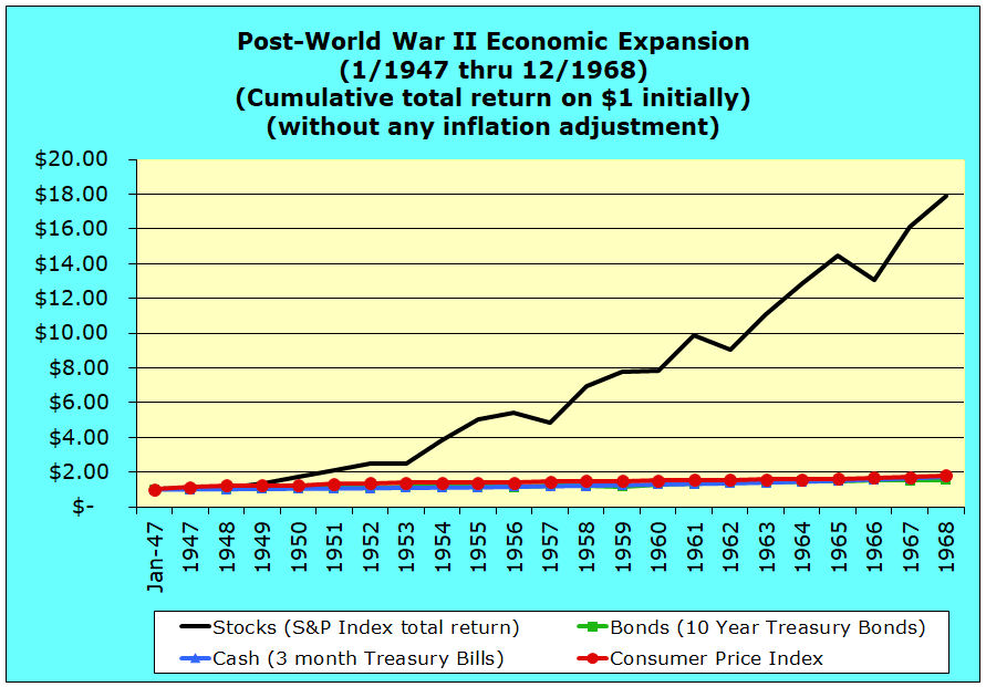
Inflation was quelled by a post-war recession. The immediate post-war inflation spike ended with a drop in inflation of -1.2% during 1949. This immediate post-war downturn saw the value of stocks fall by 8.3% in 1946. For this reason, the chart below begins with 1947 as stock markets recovered and began an upward march for two decades through 1968.
Between 1947 and 1968, there were four years in which stock values fell measured year-over-year: -1.2% in 1953, -10.46 in 1957, -8.8% in 1962 and -10.0% in 1966. Nevertheless, during the other 18 years of this period, stock values rose. In 14 of those years, inflationary stock values increased by at least 10%. Moreover for those 14 years of double digit stock appreciation, 6 years experienced stock appreciation of 10% to 20%, 4 years experienced stock appreciation of 20% to 30%, 2 years experienced stock appreciation of 30% to 40%, and 2 years experienced stock appreciation exceeding 40%, including one year exceeding 50%.
Clearly this post-WWII economic expansion and boom graph using inflationary dollars, shows that stock returns dominated cash and bond returns. Stock appreciation was dominant to the point that any possible appreciation for bonds or cash hardly registers on this inflationary dollars chart. While the inflationary value of the original stock dollar moved up by a factor of 18, the value of cash rose by just 73% and bonds by just 53% over these 22 years.
Post-World War II Economic Expansion from 1947 through 1968 using real dollars
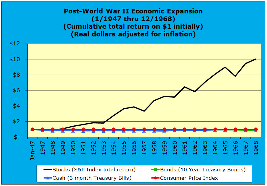
This post-WWII economic expansion graph uses real dollars, rather than the inflationary dollars presented in the graphic above. Over these twenty-two years, the purchasing power of the initial stock dollar increased by ten-fold, while the purchasing power of both cash and bonds fell actually fell. Over this period, the purchasing power of cash fell by -3% and the real dollar value of bonds decreased by and even greater cumulative -13%.
Escalating inflation and increasing economic stagnation from 1969 through 1981 using inflationary dollars
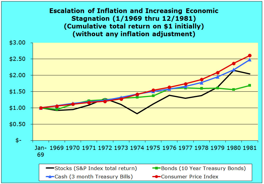
This inflationary dollar graphic for the 1969 to 1981 period demonstrates the increasingly caustic impact that sustained and increasing inflation can have to all asset classes — especially to stocks. Asset values measured in inflationary dollar increased over most of the period, yet initial one dollar invested in stocks dropped below one inflationary dollar in 1969, 1970, and again in 1974.
The fact that throughout this period that CPI line rises above the cash, bond, and stock asset classes means that all asset class did not maintain purchasing power in the face of consistently rising inflation. Clearly, the real dollar graphic below will tell a more accurate story about asset valuation.
This period became known for its economic “stagflation,” which is a mash-up of the words stagnation and inflation. The 1969 to 1981 period was known for its slow economic growth or economic stagnation, while at the same time inflation increased substantially. By the end of the period, for example, escalating inflation had driven up the interest rate on a single family home mortgage into the neighborhood of 15% — hardly conducive to economic expansion or affordable housing.
Escalation of inflation and increasing economic stagnation from 1969 through 1981 using real dollars
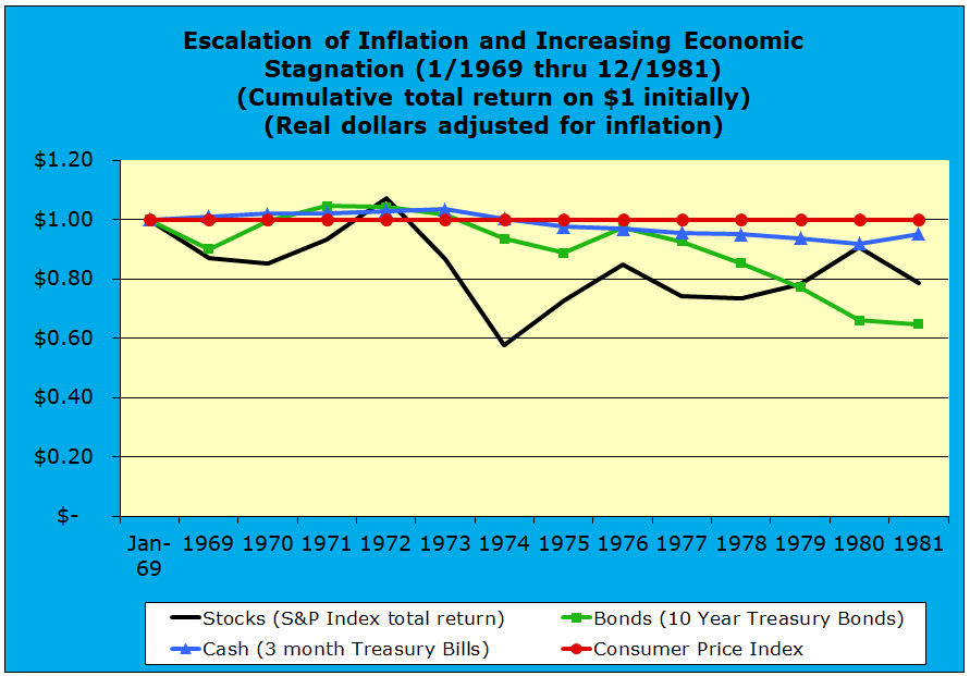
This real dollar graphic for the 1969 to 1981 period is particularly helpful in understanding the negative inflationary impacts in relative terms between the cash, bond, and stock asset classes. Initially, yields on cash (3 month treasury bill) rose slightly above inflation, but eventually lost a modest amount of purchasing power during the second half of the period. At the end of these thirteen years, the initial dollar invested in cash was worth $.95 in real dollars.
Bonds also rose in value above inflation in the 1971 through 1973 period, but they fell in value more severely from 1977 to 1981, as annual inflation rates escalated. By the end of this thirteen year period, the initial dollar invested in bonds was worth only $.65 in real dollars.
Compared to cash and bonds, increasing inflation had a more substantially negative impact on stocks in the beginning and in the middle of this period. However, relative values for stocks improved during the last several years, despite the escalation of inflation. This trend reversal reflects, in part, the ability of firms to raise prices along with inflation. By the end of this stagflation period, the initial dollar invested in stocks was worth $.78 in real dollars, trailing the purchasing power of cash, but exceeding that of bonds.
Stock and bond bull markets as inflation recedes, including the Dot Com Bubble, from 1982 through 1999 using inflationary dollars
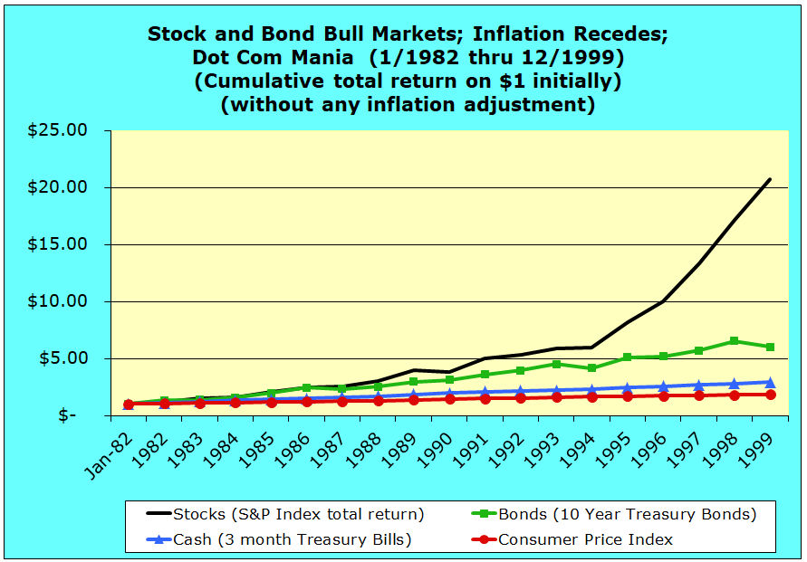
Inflation was finally defeated in the early 1980s, through harsh monetary policies and an associated recession. A two decade period of relatively high economic growth and high stock appreciation followed. The 1980s and 1990s stock value growth was comparable to the post-WWII expansion period from 1947 through 1968. However, unlike 1947 to 1968, the last two decades of the 20th century was also a bond bull market fueled by falling interest rates and a growing economy.
Stock and bond bull markets as inflation recedes, including the Dot Com Bubble mania from 1982 through 1999 using real dollars
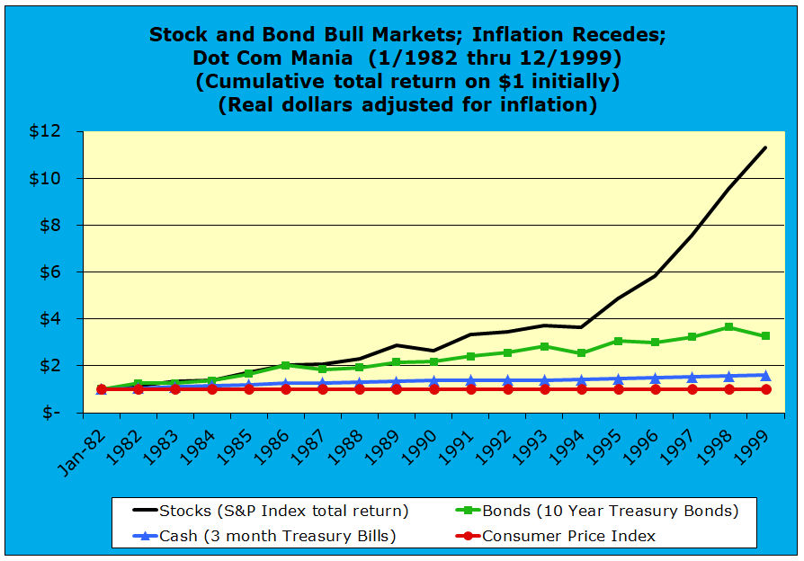
When the 1980s and 1990s are viewed in real dollars, it becomes more obvious how stock value appreciation rates differed between the two decades. In constant purchasing power terms, the initial stock dollar grew to be worth $2.89 at the end of 1989 and to $11.30 in 1999.
Bonds and cash appreciated more steadily in inflation-adjusted terms without the “birth of the Internet” growth inflection point that stocks experienced in 1994. For bonds, the initial bond asset class dollar grew in real terms to be worth $2.16 at the end of 1989 and to $3.28 in 1999. For cash, the initial cash asset class dollar grew in real dollar terms to be worth $1.34 at the end of 1989 and to $1.60 in 1999.
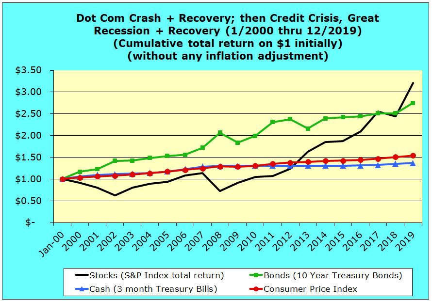
Dot Com crash and recovery, the Credit Crisis, the Great Recession, and the recovery from 2000 through 2019 using inflationary dollars
Those who were adults by the turn of the century have all lived though and been aware of the triple trauma of three crashes:
- Dot Com (or dot bomb for the more cynical),
- Credit Crisis / Great Recession, and
- Covid-19 global pandemic and economic shutdown.
For this most recent twenty-year economic period, these events are obviously fresh in our memory compared to the earlier historical periods discussed above.
The Dot Com Crash was followed by an anemic recovery pumped up somewhat by increasingly unsustainable debt. The Credit Crisis — induced by completely irresponsible financial industry mortgage underwriting, deceptively clever financial engineering, and toxic mortgage debt derivatives — broke the global banking system and quickly impacted the real economy, leading to the very ugly Great Recession.
Stock prices bottomed in March of 2009 and recovered to record levels measured by most stock market indexes. The slow revival of fragile economic growth has been facilitated by extraordinary monetary steps taken by central banks around the world. Even though the average stock market return recovered, both consumers and investors were generally shell-shocked, and our economic, financial, and monetary systems seem far from whatever “normal” is. In addition, many political systems seemed to go off the rail, during this period, as well.
During this period, bonds have been in the ascendancy and falling stock values have generated massive quantities of stomach acid. However, the bond versus stocks relative performance gap had closed substantially by the end of 2013, but it as not until 2017 that stocks finally overtook bonds in cumulative performance since 2000.
Beginning in mid-decade, one pervasive financial media meme was that the stock bull market just had gone on for too long and must end. Nevertheless this almost record length bull market in historical stock returns continued for another five years. The stock bull market was not ended by any financial manipulation or other action of man, until a prolific microscopic airborne virus brought global economies to their knees, in what initially seemed like the worst and most abrupt downturn since the Great Depression.
Another financial media meme was that the bond bull market had ended and the expected significant rise in interest rates that would dramatically and negatively impact bond values. And, oh by the way, cash earned very little interest during this period with returns below inflation, if that really needed to be pointed out.
Dot Com crash and recovery, the Credit Crisis, the Great Recession, and recovery from 2000 through 2019 using real dollars
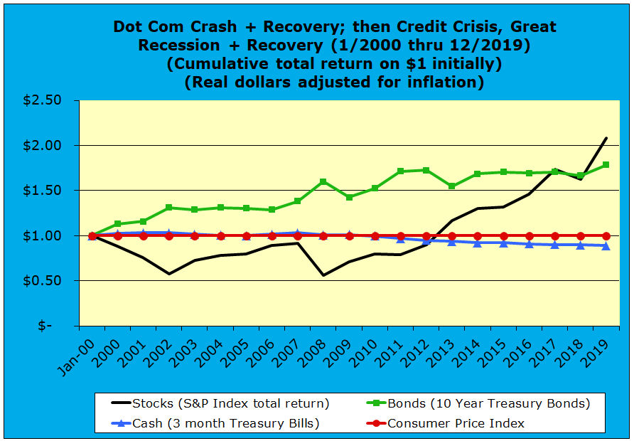
This real dollar chart for the latest 20-year period tells a similar story to the inflationary graph above. Because inflation has been relatively low and steady throughout this period of two crashes and two recoveries, making asset value adjustments for changes in CPI do not change the story of what has happened. After 20 years, people hope that we are done with all this financial crisis excitement for a very long time, but a virus waits for no one.
The Dot Com recovery of 2000 through 2008 versus the Credit Crisis/Great Recession recovery from 2009 through 2019
In the four graphics that follow, we will break down the 2000 to 2019 period to illustrate the significant differences in average stock market return, bond market return, and cash asset class performance. First, we will look at the 2000 to 2008 period in which the economy and financial markets were recovering from the dot com crash only to be faced with the Credit Crisis/Great Recession Crash of 2008. Second, we will look at the 2009 through end of 2019, which constituted the recovery from the Credit Crisis/Great Recession Crash.
Dot Com crash and recovery through the Credit Crisis/Great Recession Crash from 2000 through 2008 using inflationary dollars
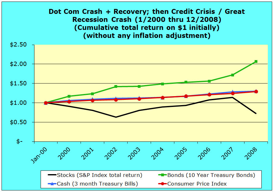
After the Dot Com crash, the US experienced what was called a jobless recovery. As a result, economic growth was anemic and the performance of the stock market reflected these factors. The 2000 to 2008 period also experienced incredible escalation in real estate values. However, this escalation in real estate values was not due to a robust underlying economy, but rather was influenced heavily by the widespread abandonment of mortgage underwriting standards.
Near the end of this period, it was said that anyone who had enough breath to fog a mirror could obtain a mortgage loan, as mortgage loan underwriting standards were debased and ignored. As real estate prices escalated, it seemed as if prices ceased to matter — instead the only thing that seemed to count was whether you could make the first month’s mortgage payment.
Without going on about the details, this game lasted until investors could see the emperor obviously had no clothes. An ocean of toxic sub-prime mortgage bonds brought on the Credit Crisis and Great Recession. The sub-prime mortgage bubble was valued at around $15 trillion — another example of the divergence of interests between the financial services industry and everyone else and guess who got bailed out for being too big to fail? It started with financial manipulation, but ended with the world at the edge of the global depression abyss.
Throughout the 2000 to 2008 period, bonds were in their ascendancy and they significantly outpaced the return performance of stocks and cash in terms of inflationary dollars.
One dollar invested in common stockholders equity at the beginning of 2000 through the end of 2008 had a cumulative gross total return factor of .72 times measured in inflationary dollars. ($1 declined to 72 cents in inflationary terms over 8 years.)
In contrast that one dollar invested in 10-year U.S. Treasury bonds at the beginning of 2000 through the end of 2008 had a cumulative gross total fixed income/bond market return factor of 2.06 times measured in inflationary dollars. ($1 grew to $2.06 in inflationary terms over 8 years.)
For cash returns one dollar invested in 3-month U.S. Treasury bills at the beginning of 2008 through the end of 2008 had a cumulative gross total return factor of 1.30 times measured in inflationary dollars. ($1 grew to $1.30 in inflationary terms over 8 years.)
Dot Com crash and recovery through the Credit Crisis/Great Recession Crash from 2000 through 2008 using real dollars
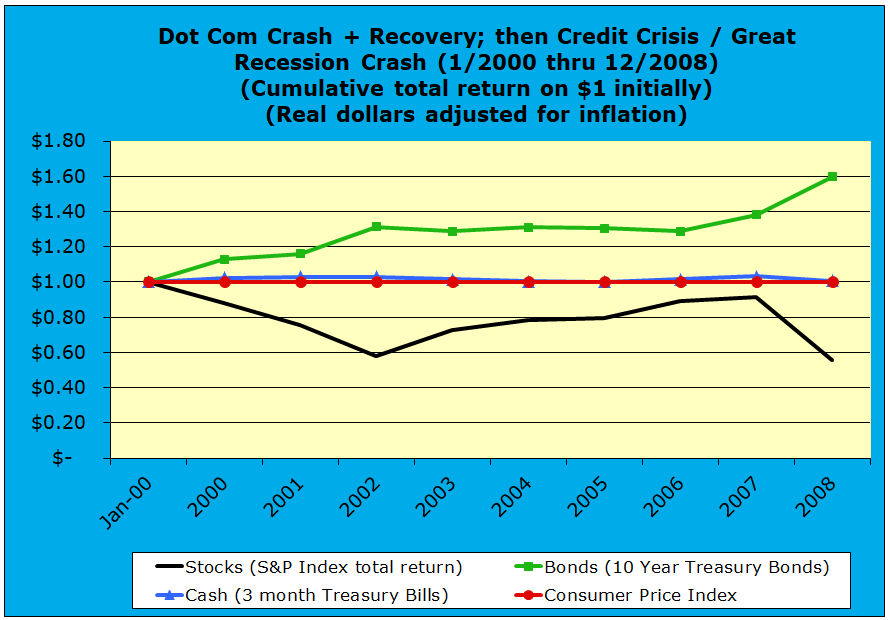
Compared to the previous inflationary dollar graphic for the 2000 to 2008 period, the real, constant purchasing power graphic immediately above is very similar. Inflation was moderate during this period. Cash returned nothing in real dollars, while bonds over-performed and stocks under-performed.
This 2000 to 2008 real, constant purchasing power dollar graphic illustrates how average stock market return lagged long-term bond market returns and cash returns. One dollar invested in common stockholders equity at the beginning of 2000 through the end of 2008 had a cumulative gross total return factor of .56 times measured in real dollars. ($1 fell to 56 cents in real dollar terms over 8 years.)
That one dollar invested in 10-year U.S. Treasury bonds at the beginning of 2000 through the end of 2008 had a cumulative gross total fixed income/bond market return factor of 1.60 times measured in real dollars. ($1 grew to $1.60 in real dollar terms over 8 years.)
For cash returns one dollar invested in 3-month U.S. Treasury bills at the beginning of 2000 through the end of 2008 had a cumulative gross total return factor of 1.01 times measured in real dollars. ($1 grew slightly to $1.01 in real dollar terms over 8 years — just barely outpacing US urban CPI inflation.)
Recovery from the Credit Crisis/Great Recession Crash — 2009 through 2019 using inflationary dollars
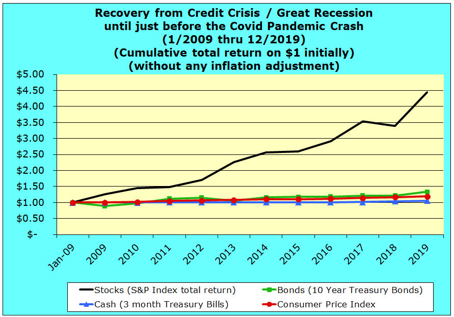
Unlike 2000 to 2008 where bonds were in their ascendancy, during the recovery from the Credit Crisis/Great Recession Crash from 2009 through 2019, the US experienced another extended period of exceptional stock market growth.
This 2009 to 2019 inflationary dollar graphic illustrates how stock market returns again dwarfed long-term bond market returns and cash returns. One dollar invested in common stockholders equity at the beginning of 2009 through the end of 2019 had a cumulative gross total return factor of 4.44 times measured in inflationary dollars. ($1 grew to $4.44 in inflationary terms over 11 years.)
In contrast that one dollar invested in 10 year U.S. Treasury bonds at the beginning of 2009 through the end of 2019 had a cumulative gross total fixed income/bond market return factor of 1.33 times measured in inflationary dollars. ($1 grew to $1.33 in inflationary terms over 11 years.)
For cash returns one dollar invested in 3 month U.S. Treasury bills at the beginning of 2009 through the end of 2019 had a cumulative gross total return factor of 1.05 times measured in inflationary dollars. ($1 grew to $1.05 in inflationary terms over 11 years.)
Recovery from the Credit Crisis/Great Recession Crash — 2009 through 2019 using real CPI adjusted dollars
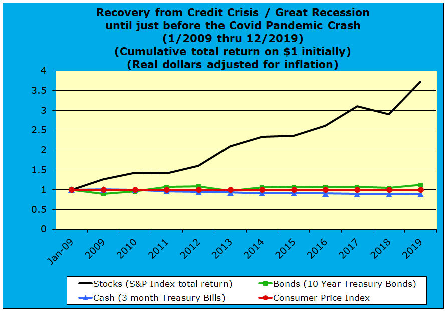
Inflation was even more subdued in the 2009 through 2019 period. In both inflationary and real constant purchasing power terms, stocks substantially outperformed bonds and cash. Cumulative cash returns trailed inflation, while total bond returns barely exceeded inflation.
In contrast, this 2009 to 2019 real, constant purchasing power dollar graphic also illustrates how stock market returns dwarfed long-term bond market returns and cash returns. One dollar invested in common stockholders equity at the beginning of 2009 through the end of 2019 had a cumulative gross total return factor of 3.73 times measured in real dollars. ($1 grew to $3.73 in real dollar terms over 11 years.)
That one dollar invested in 10 year U.S. Treasury bonds at the beginning of 2009 through the end of 2019 had a cumulative gross total fixed income/bond market return factor of 1.12 times measured in real dollars. ($1 grew to $1.12 in real dollar terms over 11 years.)
For cash returns one dollar invested in 3 month U.S. Treasury bills at the beginning of 2009 through the end of 2019 had a cumulative gross total return factor of .88 times measured in real dollars. ($1 shrank down to 88 cents in real dollar terms over 11 years.)
Conclusion
Viewing the relative 90-year historical performance of cash, bonds, and stocks broken down into these six major thematic periods tells a long-term story of “see-saw” investment performance between the primary financial investment asset classes.
During these sub-periods of relatively high economic adversity, bond assets and cash held their purchasing power better than stocks :
- Black Friday Stock market crash, Great Depression, and World War II from 1928 through 1946
- Dot Com crash and recovery, the Credit Crisis, the Great Recession, and the recovery from 2000 through 2019
During these sub-periods of relatively strong economic activity, stocks appreciated in value far more than bond asset or cash assets:
- Post-World War II economic expansion from 1947 through 1968
- Stock and bond bull markets as inflation receded, including the Dot Com Bubble mania from 1982 through 1999
- Recovery from the Credit Crisis, Great Recession — 2009 through 2019
Only during this middle sub-period of stagflation were comparative asset class returns mixed and relatively close to each other, when compared to the other major sub-periods:
- Escalation of inflation and increasing economic stagnation from 1969 through 1981
Several things do stand out, when one looks at the long-term historical data in this manner:
- There have been extended periods when one or another asset class is generally ascendant or descendant.
- Even within periods that seemed generally to have favored one asset class over another, there been significant trend reversals in comparative asset class performance.
- In the periods when stocks have been ascendant, their appreciation multiples have been very high in both inflationary or real dollar terms. This largely accounts for the cumulative dominance of stock performance across the entire period.
- A broad, long-term, but unpredictable picture of reversion toward upward trending return averages is presented for bonds and stocks. Obviously, the upward trending performance averages differ dramatically between bonds and stocks, while cash returns have barely exceeded long-term inflation.
The selection of beginning-points and ending-points for these periods was arbitrary and driven by historical hind-sight knowledge. Nevertheless, these periods do present a long-term, cyclical pattern. These extended periods alternated or see-sawed between “good and bad” stock appreciation episodes.
Going forward can we now expect an extended period of relatively high bond or average stock market return appreciation? The answer is either an emphatic “no” or a perhaps a more wishy-washy “maybe – maybe not,” which really means do not count on it.
A statistician would complain about the paucity of data points, the pitfalls of data mining, etc. The problem is that historical data is solely informative. It can never be predictive. History knows nothing about the future, and neither do any of us.
Securities history is not predictive regarding any particular aspect of the future, but historical returns and price volatility do illustrate the varying risk premiums that the various asset classes have paid over time. The only sane response to the uncertainty of investment risk and reward across asset classes is to diversify broadly and thoroughly.
Even then, each investor is challenged to determine how much to allocate to cash, bond, and stock securities. At one extreme, one could hold all cash, but history tells us that cash pays only a very small return over inflation. At the other extreme, one could hold all stocks, but history tells us that one needs a strong stomach and iron will to endure price fluctuations in pursuit of the higher risk premium that has been paid to equities.
Each individual investor and all investors in aggregate must face the future with complete uncertainty. All investment crystal balls are really completely opaque for both professional and amateur investors. Despite theories, models, and firmly held beliefs about the future, any belief in predictability is largely delusional.
The more certain any future event is to a larger number of investors, the larger the shock to the system when an improbable “black swan” presents itself. The factors that gave rise to the mortgage derivatives driven credit crisis of the past decade represent just another major delusion that later was made plain to investors. And, if so very few people saw the credit crisis coming, even fewer in the financial industry saw the potential downside of a global respiratory pandemic.
Nevertheless, I do hope that this graphical review of the past 90+years of U.S. asset class performance has been illuminating. Understanding the historical context of relative equity, fixed income, and cash financial asset class performance at least provides some reference points for deciding one’s investment strategy in the face of complete uncertainty about actual future events.
Larry Russell wrote this article. He is a Pasadena, California fee-only family and retirement financial planning consultant and registered investment adviser. He is also the developer of the VeriPlan personal financial planning software. Larry Russell is also a strong proponent of investment cost reduction. There are no reliable strategies that will beat the market, and historical performance of a particular investment tells you nothing about its future performance. (Read the fine print — it ALWAYS says this and it is true.) Therefore, reducing investment costs to a minimum it the only practical strategy that ensures investors will keep the highest portion of their gross returns. Individual investors do not need to spend their lives paying tribute to the financial services industry without receiving commensurate benefits. Larry helps investors pull the plug on excessive investment fees through his personal investing books and articles.